What Is a Heatmap? How B2B SaaS Teams Use It to Boost Onboarding and Conversions
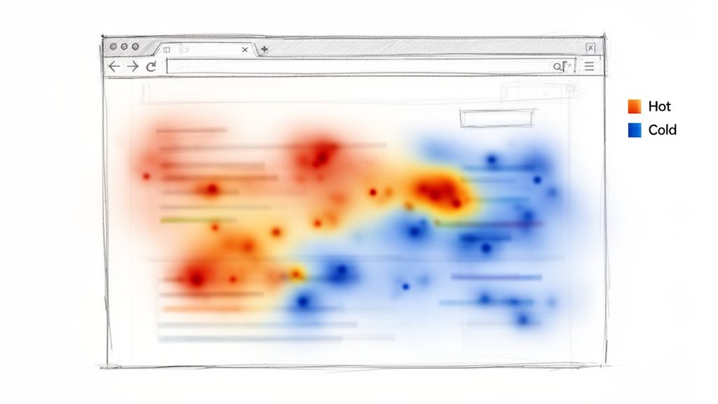
A heatmap is a visual overlay of your product UI that uses color intensity to show where users click, move, and scroll. Instead of reviewing sessions one-by-one, you can see aggregate behavior patterns at a glance — where attention concentrates, where it drops, and where confusion is happening.
Heatmaps are especially useful in the trial-to-value window. They help you diagnose why trial users churn before experiencing the “aha” moment by turning behavior traces into concrete hypotheses you can test.
Heatmaps don’t replace analytics
Heatmaps show where behavior happens. Product analytics (funnels, events) tell you how many users get stuck. Session replays help explain why. Use them together.
Connecting Heatmaps to SaaS Metrics
A heatmap is not just a pretty visualization. It’s a direct bridge from observed behavior to improved onboarding, activation, and conversion.
Here are three concrete metric connections:
- Trial-to-paid conversion rate: A scroll map shows 90% of trial users never see your most important upgrade proof point because it’s buried below the fold.
- Time-to-value (TTV): A click map reveals users repeatedly click a static screenshot during onboarding, expecting it to open a setup flow.
- Feature adoption rate: Your new feature CTA is cold blue. The UI isn’t communicating value or isn’t discoverable where users need it.
A Practical Onboarding Example
Imagine a three-step onboarding flow where analytics shows a 75% drop-off after step one — but the funnel doesn’t explain why.
A heatmap on step one reveals a bright hotspot on a tiny, non-interactive icon in the header. Users click it repeatedly, assuming it’s a help guide or a “skip” control. They get stuck, frustrated, and churn.
That’s a conversion killer you’ll rarely catch from aggregate events alone.
If you’re improving early onboarding, pair this with our guide on customer onboarding best practices.
The Four Lenses: Types of Heatmaps
Heatmaps aren’t one thing — they’re a set of lenses. Each answers a different question and maps to different onboarding problems.
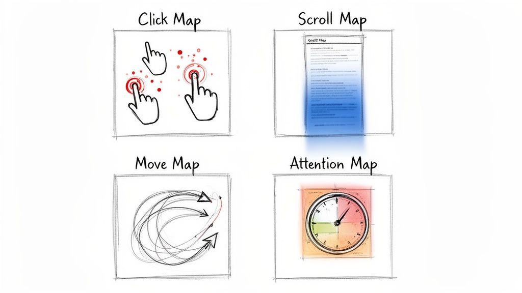
1) Click Maps Reveal Intent (and Confusion)
Click maps aggregate taps and clicks. Hot spots show what users think is interactive.
Scenario
Your dashboard shows a red cluster over a static “beta” label next to a new feature. Users expect a tooltip. That confusion often drags down adoption because users can’t learn what the feature does.
2) Scroll Maps Expose Visibility Problems
Scroll maps show how far users get before they leave. If the page turns cold above key content, users aren’t seeing what you need them to see.
- A pricing scroll map goes ice-cold above your highest tier.
- An onboarding scroll map drops sharply before the activation step.
3) Move Maps Indicate Reading and Consideration
Move maps track cursor movement (a proxy for attention on desktop). It’s helpful for long-form onboarding screens, docs, and setup guides.
4) Attention Maps Show What Users Linger On
Attention maps combine scroll depth with time-on-section. Long dwell time can mean “engaged” or “confused.” Pair it with replays to tell the difference.
From Colours on a Screen to Real Conversions
Heatmaps are only valuable when you translate patterns into experiments.
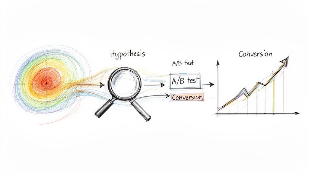
A Simple Framework: Observe → Hypothesize → Test → Measure
- Observe the pattern: No clicks on a key button, rage clicks on a disabled control, or a huge scroll drop-off.
- Form a hypothesis: “Users aren’t inviting teammates because the CTA is hidden and unclear.”
- Define a testable change: Move the CTA, change copy, add contextual help, reduce form fields.
- Measure the business outcome: Activation rate, TTV, adoption rate, trial-to-paid.
Want to choose the right KPI for the test? Start with engagement metrics.
Rage Clicks: A Useful Friction Signal
Repeated rapid clicks on the same element usually mean frustration.
Practical example: Trial users rage-click a disabled “Export Report” button. They want it, can’t access it, and churn. Your options are clear: unlock it in trial, explain why it’s locked, or show a visible upgrade path.
How To Run Your First Heatmap Analysis
Don’t instrument everything. Start with a single metric question and a small set of high-impact pages.
Three Pages to Start With
- Post-signup / first-run screen: Does the user understand what to do next? This impacts TTV.
- Core feature screen: Is the UI intuitive, or are users getting stuck? This impacts adoption.
- Pricing / upgrade screen: Are users seeing your strongest value proof? This impacts conversion.
Segment Users (or You’ll Miss the Signal)
Aggregating everyone together blurs the story. Compare at least two segments:
- Users who activated a key feature
- Trial users who churned within a short window
The contrast often reveals the exact friction points that matter.
Five-Step Checklist
- Define your question: “Why do only 10% of trial users invite a teammate?”
- Choose the segment: “New trial users in their first session.”
- Pick the heatmap type: Click map for CTA visibility, scroll map for content reach.
- Set a collection window: Long enough for a meaningful sample.
- Schedule analysis time: A heatmap without review is just a screenshot.
Common Heatmap Mistakes (and How To Avoid Them)
Mistake 1: Treating Hot Spots as “Success”
Hot can mean “interest” — or “frustration.” Always validate with replays.
Mistake 2: Ignoring Segmentation
If you don’t split churned trials vs activated users, you’ll end up optimizing for the average user — and the average user doesn’t exist.
Mistake 3: Forgetting the Metric Connection
Heatmaps without a KPI are interesting, not actionable.
| Checklist Item | Why It Matters | How To Verify |
|---|---|---|
| Clear question defined? | Prevents aimless analysis and ties work to a goal. | Your notes start with “I want to understand why…” |
| Adequate sample size? | Too few users creates noise and false conclusions. | Confirm volume for the specific page + segment. |
| Focused user segment? | Aggregates hide the truth; segments reveal it. | Heatmap name includes the segment and device. |
| Cross-referenced with other data? | Heatmaps show what, not why. | Use funnels + watch replays on hot/cold areas. |
| Tied to a business metric? | Makes the insight measurable and prioritizable. | Takeaway sounds like “This hurts activation rate.” |
The EngageKit View: Why Scored Events Beat Heatmaps for Decisions
Heatmaps can look definitive, but in B2B SaaS they’re often a weak signal for “what to do next.” They’re best at catching UI friction — misclicks, ignored CTAs, and content that sits below the fold.
Where they break down is decision-making:
- They’re aggregate by default: averages can hide the segment that matters (the accounts that convert, expand, or churn).
- They can’t tell you “value happened”: clicks and scroll depth aren’t the same as completing activation milestones.
- They struggle with complex products: multi-page flows, role-based UX, and long sales cycles aren’t captured well by a single screen overlay.
EngageKit takes a different approach: we help teams surface product data using scored events. Instead of asking “Where did users click?”, you score the behaviors that actually predict outcomes (activation, retention, expansion) — and turn them into a single, actionable signal.
Practically, this means you can:
- Define what matters: assign weights to the events that represent real value in your product.
- Track progress over time: detect engagement decay and stalled onboarding before churn happens.
- Make lifecycle-aware decisions: thresholds and “good engagement” should differ for new trials vs established customers.
Heatmaps are still useful — especially for debugging confusing screens. But for prioritization and go-to-market alignment, scored events are typically more reliable because they connect behavior to outcomes.
Questions We Hear All The Time
How Many Pageviews Do I Need?
There’s no single magic number. The goal is enough volume to see stable patterns for the page and segment you care about. Low-traffic screens may need a longer collection window.
Can Heatmaps Slow Down My App?
Most tools load asynchronously and are designed to minimize performance impact — but always verify with your own performance monitoring.
Heatmaps vs Session Replays: What’s the Difference?
Heatmaps show the forest. Session replays show the trees.
- Heatmaps answer: “What do most users do?”
- Replays answer: “What happened for this user, and why?”
Subscribe to our newsletter
The latest news, articles, and resources, sent to your inbox weekly.